PHOTOS: What the world map looks like if scaled by population

WTVD logo
Wednesday, January 28, 2015
Reddit user TeaDranks took the time to redesign the world map to represent each country's size according to its population.
1 of 16
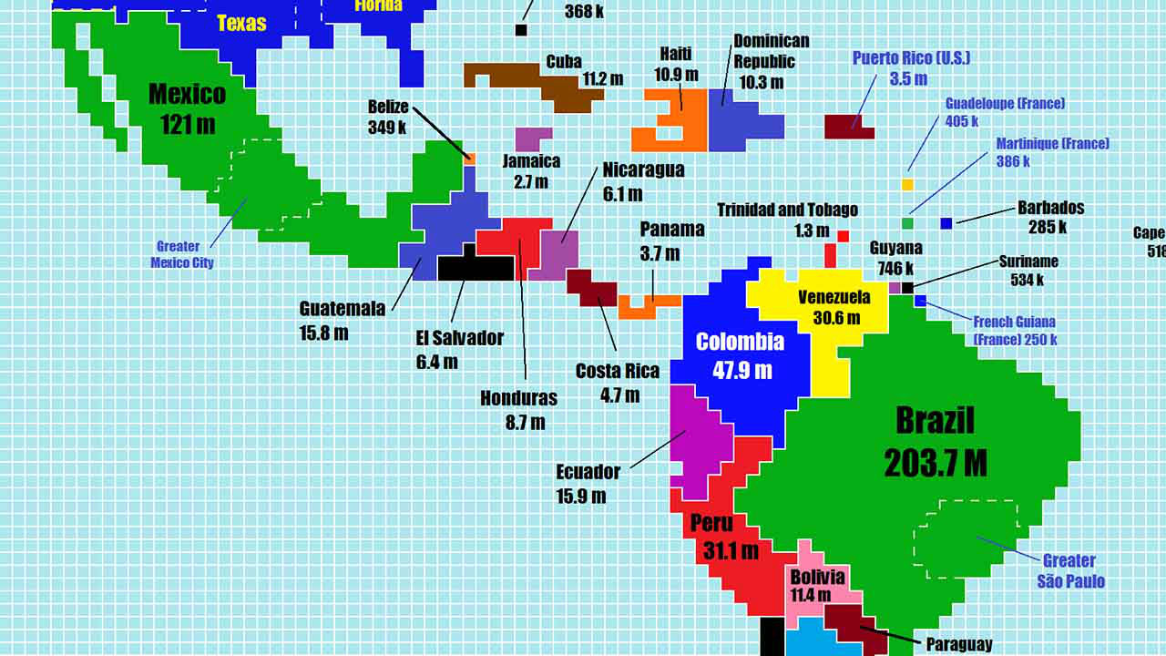
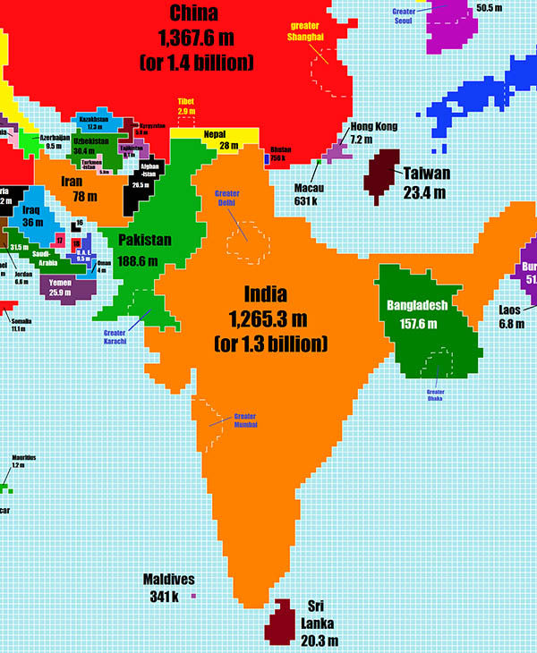
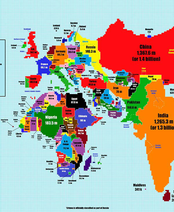
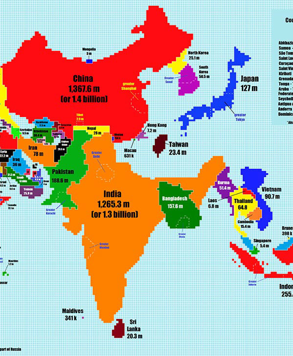
PHOTOS: What the world map looks like if scaled by populationReddit user TeaDranks took the time to redesign the world map to represent each country's size according to its population.
TeaDranks - Chase Mohrman