24/7 Live
Raleigh
Durham
Fayetteville
Surrounding Area
PHOTOS: What the world map looks like if scaled by population
Wednesday, January 28, 2015
1 of 16
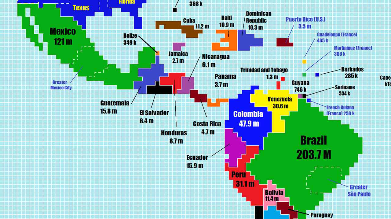
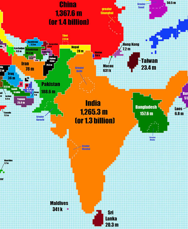
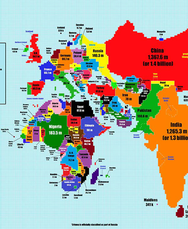
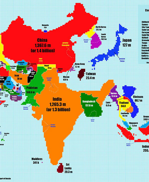
Reddit user TeaDranks took the time to redesign the world map to represent each country's size according to its population.
TeaDranks - Chase Mohrman
Report a correction or typo
Copyright © 2026 WTVD-TV. All Rights Reserved.
Watch Live
ON NOW
Top Stories
Morrisville Police respond after call of shots fired
Spirit Airlines shut down: What to do to get home and get refunds
Runners qualify for Boston Marathon at Durham event
3 hours ago
NC bill would change reallocation meal taxes in Wake County
Lee County deputy chase leads to extensive drug charges
Makers of abortion pill mifepristone file SCOTUS emergency appeal
What to know about Spirit Airlines 'winding down all operations'
11 minutes ago
Drier and brighter end to the weekend
3 hours ago